At Billtrust, I designed and developed an interactive product discovery experience for the enterprise solutions overview page that helped users better understand how Billtrust products work together to modernize accounts receivable processes.
The experience centered around a synchronized accordion and product relationship system that dynamically highlighted relevant products based on customer use cases. Users could explore workflows, understand product relationships, and launch contextual product modals without leaving the page.
What initially appeared to be “just an accordion” ultimately became a sophisticated UX engineering challenge involving:
- state synchronization
- interaction architecture
- accessibility compliance
- responsive design
- progressive disclosure
- conversion optimization
- contextual product storytelling
The project required balancing technical performance, usability, accessibility, and marketing objectives within a highly visible enterprise marketing experience.
The Business Problem
Billtrust offers multiple accounts receivable solutions across areas such as:
- Credit
- Collections
- Payments
- Cash Application
- Invoicing
- eCommerce
One of the challenges facing enterprise visitors was understanding how these products interconnected across real-world business workflows.
Traditional product grids and static content blocks introduced several UX issues:
- Users struggled to connect products to business outcomes
- Product relationships were unclear
- Content density created cognitive overload
- Product discovery required excessive navigation
- Mobile experiences became difficult to scan and consume
- Enterprise workflows were difficult to visualize quickly
The business needed a solution that:
- Simplified product discovery
- Connected products to operational use cases
- Reduced friction in the buyer journey
- Increased engagement with product pages
- Improved UX clarity across devices
- Maintained accessibility and performance standards
Project Goals
The project had several core objectives.
UX Goals
- Improve discoverability of Billtrust solutions
- Reduce cognitive load
- Create contextual product relationships
- Improve interaction continuity
- Build a more intuitive exploration experience
Technical Goals
- Maintain lightweight frontend performance
- Avoid unnecessary framework overhead
- Preserve accessibility compliance
- Ensure responsive adaptability
- Create reusable interaction patterns
- Support scalable content relationships
Marketing Goals
- Increase product engagement
- Support conversion pathways
- Improve content consumption
- Guide users deeper into the product ecosystem
- Strengthen product storytelling
What the Application Does
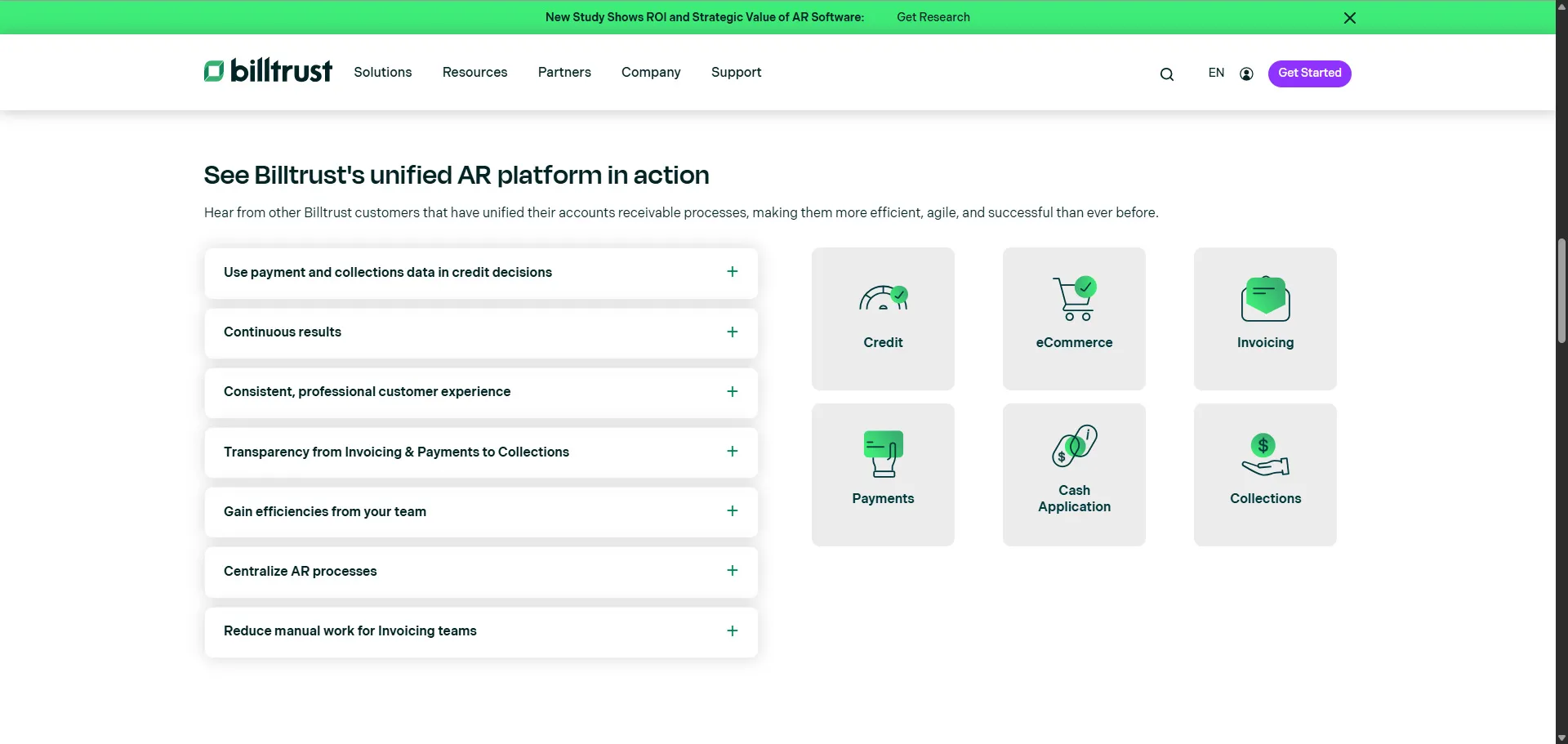
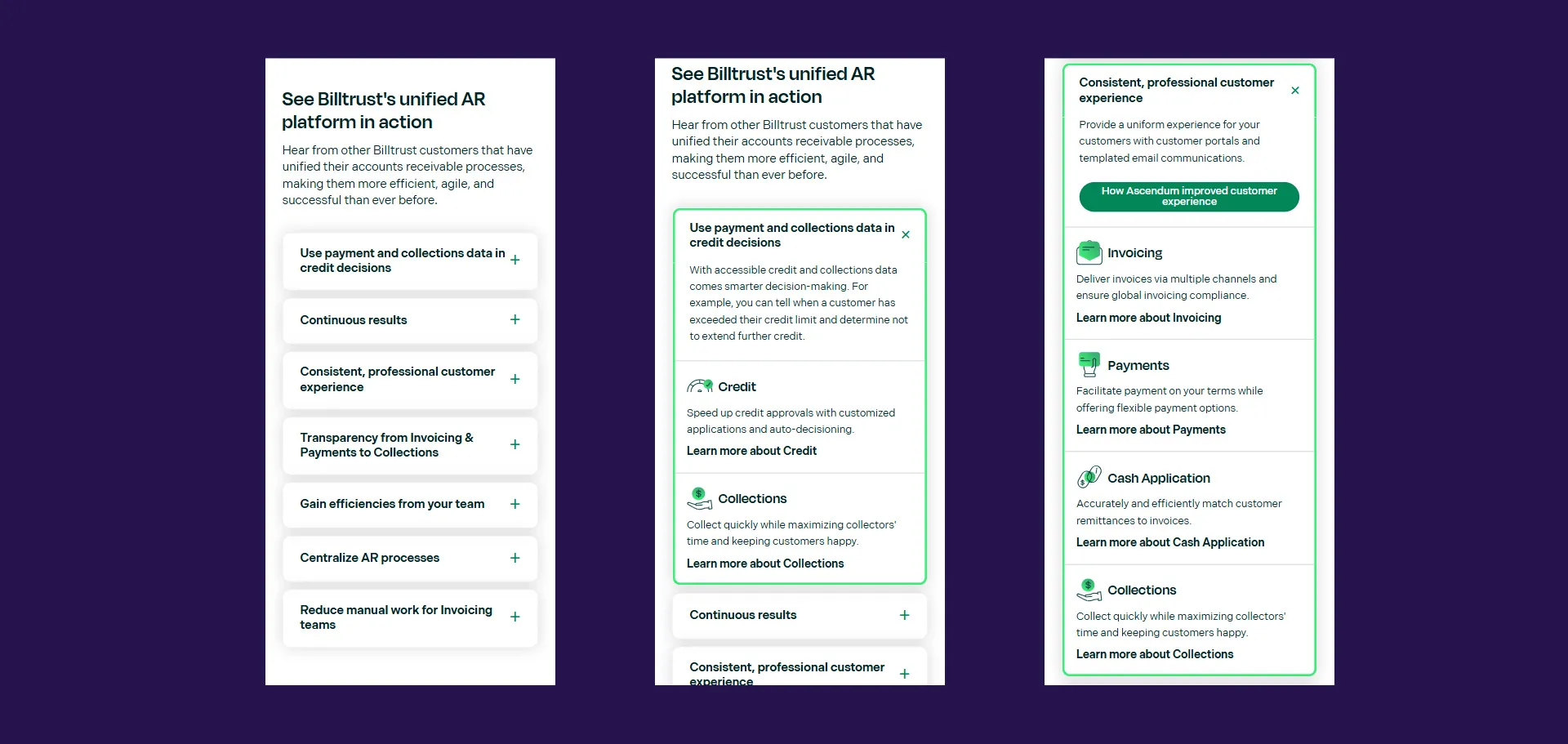
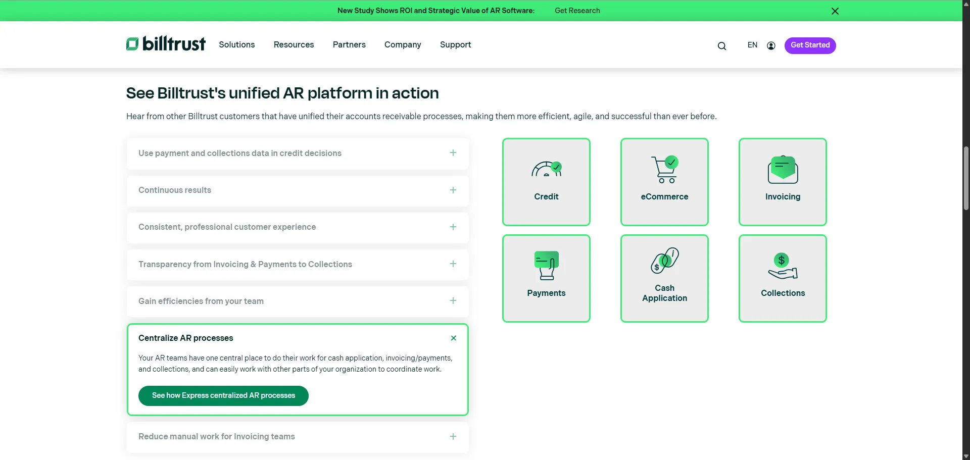
The application consisted of a two-column synchronized interaction system.
Left Column: Use Case Accordion
The left side contained seven accordion items representing customer business outcomes and operational workflows.
Examples included:
- Continuous results
- Centralize AR processes
- Gain efficiencies from your team
- Transparency from invoicing to collections
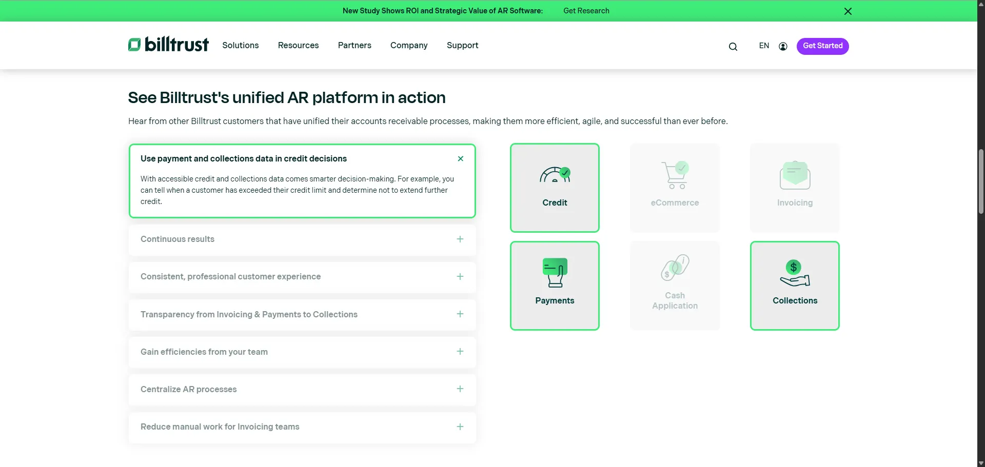
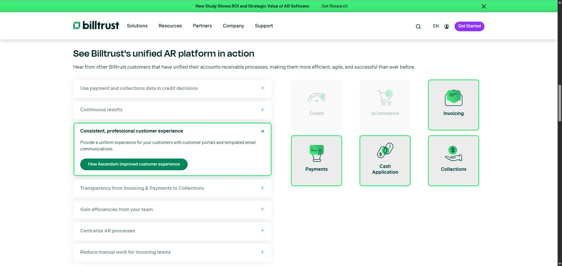
When users selected an accordion item:
- The section expanded dynamically
- Contextual explanatory content appeared
- Related products were highlighted in the right column
- Non-relevant products became visually de-emphasized
Right Column: Product Relationship Grid
The right column displayed a visual grid of Billtrust products.
The product grid dynamically responded to:
- accordion click state
- hover state
- active interaction state
This created a synchronized product discovery experience where users could immediately understand which solutions mapped to each business use case.

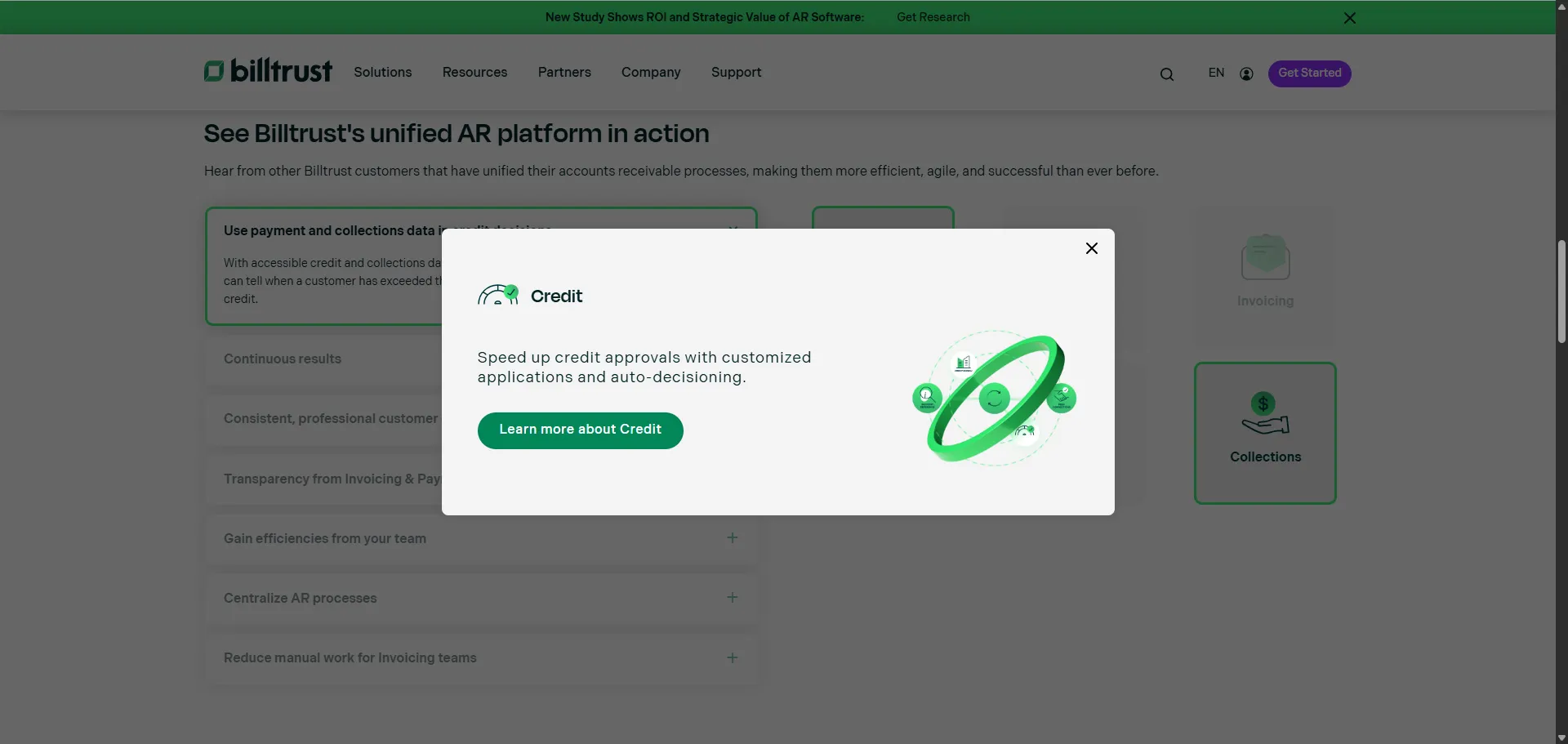
Product Modals
When users selected an active product:
- a modal window opened
- additional product information appeared
- a CTA directed users to the corresponding product page
This allowed users to continue exploring without losing their current page context.
Responsive Mobile Experience
On mobile devices, the interaction model shifted entirely.
Instead of attempting to preserve the synchronized two-column experience, product information was embedded directly inside accordion sections.
This reduced friction and improved usability on smaller screens.
UX Strategy and Interaction Design
One of the primary design goals was reducing cognitive overload while preserving information richness.
Enterprise software websites often struggle with presenting large ecosystems of interconnected products without overwhelming users.
To solve this, I used a progressive disclosure model.
Progressive Disclosure
Users were not shown all information simultaneously.
Instead:
- A user selects a business use case
- Related products become visually prioritized
- Supporting context appears progressively
- Product details remain one interaction away via modal
This created a guided exploration experience rather than a static information dump.
Frontend Architecture
Semantic HTML Structure
The experience was built using semantic HTML and accessible interaction patterns.
Example:
<button
  class="accordion-trigger"
  aria-expanded="false"
  aria-controls="accordion-content-1"
></button>
The implementation included:
- semantic buttons
- accessible regions
- proper heading hierarchy
- ARIA state management
- logical content grouping
This helped ensure ADA compliance and keyboard accessibility.
Relationship-Based State Architecture
One of the more interesting architectural decisions was the use of relationship-based CSS grouping.
Products and accordion items shared group classifications:
<li class="bt-uc-product-item group-2 group-3 active"></li>This lightweight relational structure allowed:
- dynamic UI synchronization
- contextual highlighting
- reusable interaction logic
- scalable state relationships
without introducing a heavy frontend framework.
The architecture effectively created a declarative relationship mapping system using semantic class structures.
JavaScript Interaction System
The JavaScript layer orchestrated:
- accordion expansion
- hover interactions
- active states
- synchronized product filtering
- modal coordination
- smooth scrolling behavior
Accordion State Management
The application dynamically managed accordion state using reusable interaction handlers:
const toggleAccordion = (index) => {
  resetAccordions(index);

  const currentAccordion = accordionItems[index];
  currentAccordion.classList.toggle('is-active');
};
This ensured:
- only one accordion remained active
- visual consistency stayed synchronized
- inactive sections became visually de-emphasized
Hover-Driven Contextual Discovery
One particularly interesting UX enhancement was hover synchronization.
Even before selecting an accordion item, users could preview product relationships simply by hovering over a use case.
accordion.addEventListener('mouseover', () => {
  accordion.classList.add('hover-is-active');
});
This created:
- lower-friction exploration
- interaction predictability
- faster information discovery
- richer desktop engagement
Smooth Scrolling and Interaction Continuity
Accordions often create difficult navigation experiences because expanded content can shift beyond the viewport.
To solve this, I implemented smooth-scroll positioning logic that automatically repositioned selected accordion content closer to the center of the viewport.
window.scroll({
  top: top - headerHeight,
  behavior: 'smooth',
});
This significantly improved:
- orientation
- usability
- interaction continuity
- mobile navigation flow
It was a small implementation detail with a large UX impact.
CSS Architecture
The CSS architecture focused heavily on:
- visual hierarchy
- state transitions
- contextual emphasis
- responsive adaptability
Visual State Communication
Rather than relying on excessive animation, the interface used:
- opacity
- border states
- hover feedback
- spacing
- color hierarchy
to guide user attention.
Example:
.bt-uc-right-column ul li.active {
  opacity: 1;
}

.bt-uc-right-column li {
  opacity: 0.3;
}
This subtle visual system helped users quickly identify which products were relevant to their selected workflow.
Responsive Design Strategy
The responsive strategy intentionally changed the interaction model at mobile breakpoints.
Desktop Experience
- synchronized two-column layout
- sticky product visualization
- hover interactions
Mobile Experience
- embedded contextual product cards
- simplified interaction model
- vertically optimized navigation
@media screen and (max-width: 768px) {
  .bt-uc-right-column {
    display: none;
  }
}
Instead of shrinking a desktop experience onto smaller screens, the UI adapted to match mobile interaction behavior.
Accessibility and ADA Considerations
Accessibility was an important part of the implementation.
The experience included:
- keyboard-accessible controls
- semantic buttons
- ARIA relationships
- focusable interactions
- accessible labeling
- logical heading hierarchy
The accordion implementation specifically used:
aria-expandedaria-controlsaria-labelledbyrole="region"
This helped align the component with accessible interaction standards expected in enterprise environments.
Performance Considerations
A major architectural goal was maintaining a lightweight frontend footprint.
The solution intentionally avoided:
- heavy JavaScript frameworks
- unnecessary animation libraries
- large interaction dependencies
Instead, the experience relied heavily on:
- semantic HTML
- CSS-driven states
- lightweight JavaScript orchestration
- reusable interaction patterns
This approach supported:
- faster rendering
- improved maintainability
- stronger Core Web Vitals
- lower runtime overhead
- improved SEO performance
Business and Marketing Impact
This project directly supported both user experience and marketing performance goals.
Improved Product Discovery
Users could immediately understand:
- which products related to which business challenges
- how solutions interconnected
- which workflows Billtrust supported
Reduced Navigation Friction
The modal-based exploration model reduced:
- unnecessary page transitions
- context switching
- discovery friction
Stronger Product Storytelling
Instead of presenting products as isolated offerings, the experience framed them as part of a unified AR ecosystem.
This better aligned with how enterprise buyers evaluate operational software platforms.
Increased Engagement Opportunities
The interaction model naturally encouraged:
- deeper product exploration
- longer engagement sessions
- additional CTA interactions
- contextual learning pathways
Lessons Learned
Several important lessons came out of this project.
Small UX Improvements Have Outsized Impact
The smooth-scrolling enhancement was relatively simple technically, but dramatically improved usability.
Tiny interaction details often shape overall user perception more than large visual redesigns.
Lightweight Architectures Can Scale Extremely Well
Not every advanced interaction requires a frontend framework.
Careful semantic architecture combined with lightweight JavaScript can still produce highly sophisticated experiences.
Accessibility Should Be Built Into Interaction Design Early
Retrofitting accessibility later becomes significantly more difficult.
Designing semantic interaction patterns from the beginning created a stronger final implementation.
Marketing Experiences Benefit From Engineering Discipline
Enterprise marketing websites are often treated as purely visual projects.
In reality, they benefit tremendously from:
- frontend architecture thinking
- performance engineering
- interaction modeling
- state management discipline
Conclusion
This project became much more than a standard accordion implementation.
It evolved into a contextual product discovery platform that balanced:
- UX clarity
- frontend architecture
- accessibility
- responsiveness
- performance
- conversion optimization
The experience helped users better understand how Billtrust products worked together while creating a more intuitive and engaging customer journey.
Projects like this continue to reinforce something I strongly believe as a frontend technologist:
The best enterprise web experiences happen when engineering, UX, accessibility, and marketing strategy work together as a unified system.