Choosing the right ski resort season pass can be surprisingly overwhelming.
Different pass tiers, blackout dates, age-based pricing, renewal discounts, benefits, restrictions, and promotional offers can quickly create decision fatigue — especially on mobile devices where comparison tables often become difficult to navigate.
While working at Sierra-at-Tahoe, I designed and developed a fully responsive season pass comparison and filtering experience focused on simplifying purchase decisions for guests while supporting online sales growth during a critical revenue period.
The experience combined:
- Dynamic pass filtering
- Responsive pricing cards
- Renewing vs. new passholder pricing toggles
- Interactive benefit explanations
- Mobile-first usability improvements
- Personalized discovery patterns
The result was a significantly more user-friendly pass shopping experience that helped guests quickly identify the best pass for their needs while contributing to increased online season pass revenue.
The Business Problem
Season passes represented one of Sierra-at-Tahoe’s most important annual revenue drivers.
However, guests frequently struggled with questions like:
- Which pass works best for me?
- Can I ski weekends?
- Are holidays included?
- Which pass supports my age group?
- What benefits are actually included?
- Should I renew or buy new?
- Why is one pass more expensive than another?
The existing pricing presentation placed a heavy cognitive load on users, particularly mobile users attempting to compare multiple pass options on smaller screens.
The objective was to create an experience that:
- Reduced friction during pass selection
- Improved mobile usability
- Increased confidence during purchase decisions
- Helped users self-segment into the correct pass type
- Improved visibility of passholder benefits
- Increased online season pass conversions
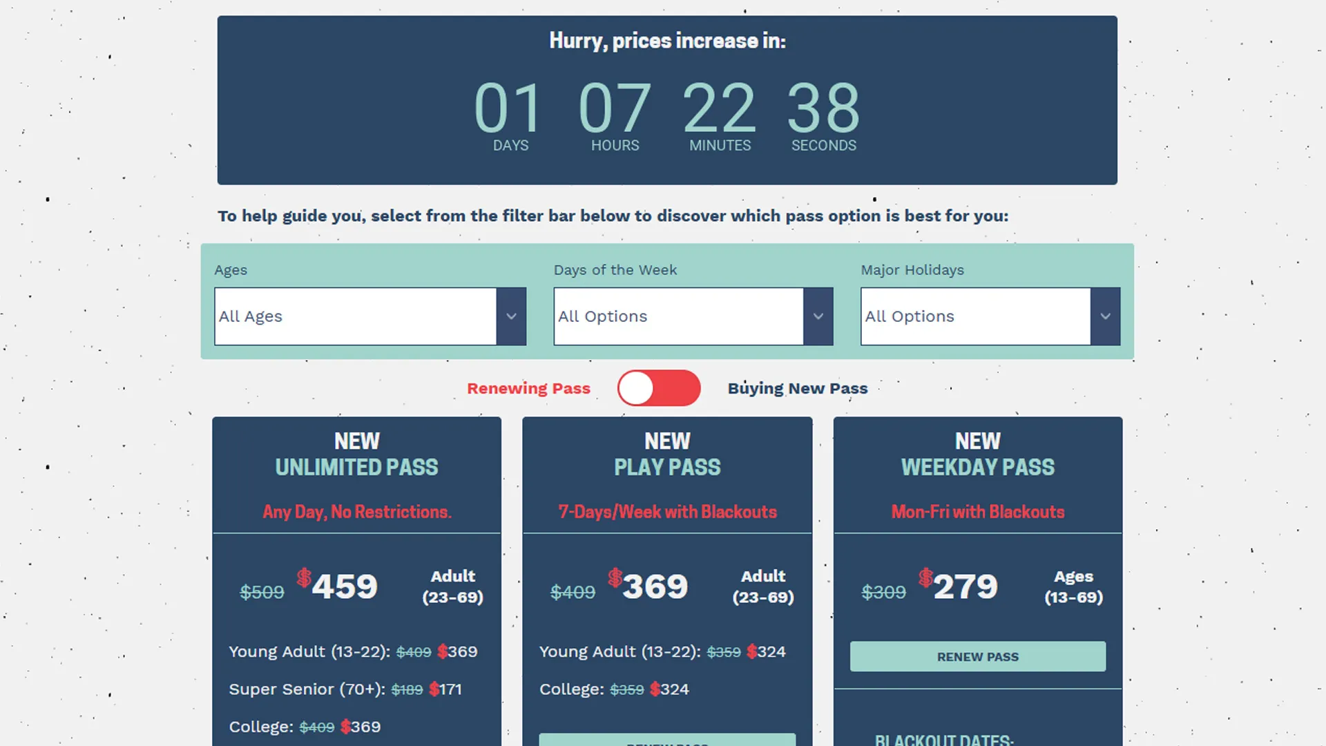
What the Application Does
The application functions as an interactive season pass discovery and comparison experience.
Users can:
- Filter passes by age eligibility
- Filter passes by ski day preferences
- Filter passes by holiday access
- Compare passholder benefits
- View renewing vs. new passholder pricing
- Learn more through interactive benefit modals
- Purchase or renew directly from the interface
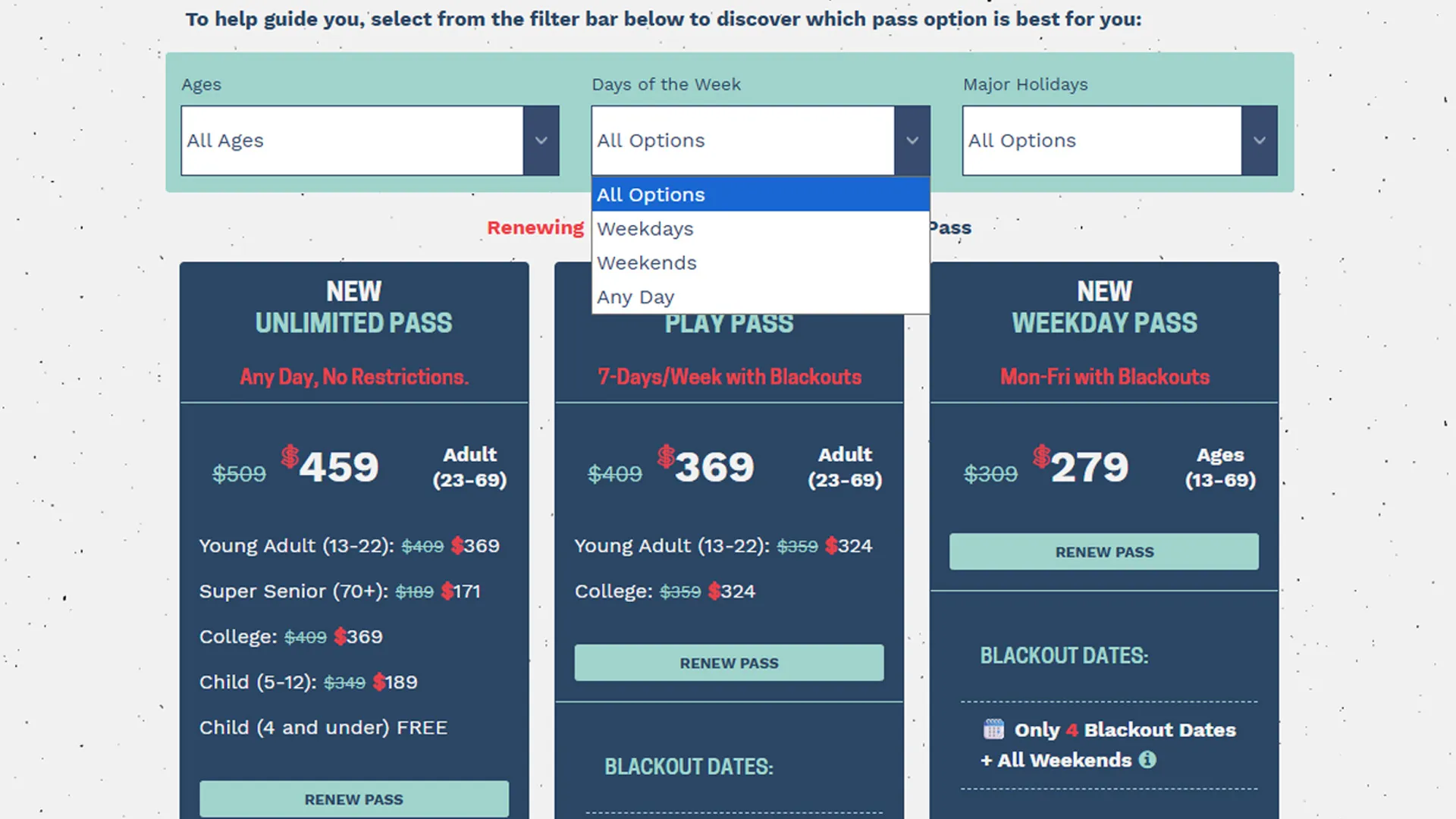
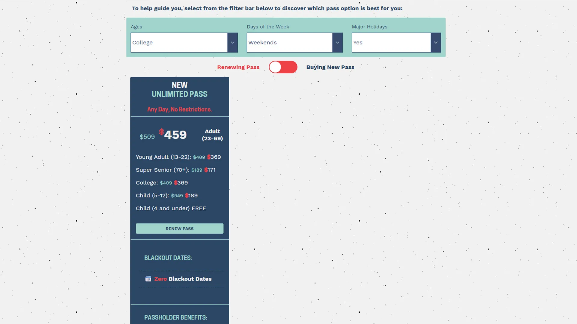
The system dynamically hides passes that do not match selected criteria, allowing users to narrow choices in real time without reloading the page.
For example:
- A guest selecting Weekdays + No Holiday Access would primarily see the Weekday Pass.
- A guest selecting Any Day + All Ages would surface the Unlimited Pass.
- College students would only see passes available to college-aged users.
This transformed a static pricing table into a guided product discovery experience.
Core UX Strategy
The project centered around one core UX principle:
Reduce complexity by progressively narrowing choices.
Instead of asking users to manually compare every pass detail themselves, the filtering interface guided them toward the most appropriate option.
This approach mirrors modern eCommerce filtering patterns commonly used in:
- Retail product discovery
- Travel booking interfaces
- SaaS plan comparison tools
- Subscription selection flows
The experience intentionally balanced:
- Simplicity
- Discoverability
- Information density
- Mobile usability
- Conversion-focused interaction design
Building the Filtering System
The filtering experience was powered entirely with semantic HTML class relationships and lightweight JavaScript logic.
Each season pass card included descriptive utility classes representing eligibility and restrictions:
<div class="listing1 holNo wkday adults yadults college col-md-4 text-center"></div>These classes acted as filterable attributes:
| Class | Meaning |
|---|---|
.holNo | No holiday access |
.wkday | Weekday access |
.adults | Adult eligibility |
.college | College eligibility |
.yadults | Young adult eligibility |
The filter UI exposed these attributes through dropdown controls:
<select id="DaysFilter">
  <option>All Options</option>
  <option data-filter=".wkday" value=".wkday">Weekdays</option>
  <option data-filter=".wkend" value=".wkend">Weekends</option>
  <option data-filter=".wdwe" value=".wdwe">Any Day</option>
</select>
This structure created a lightweight, scalable filtering system without requiring a heavy frontend framework.
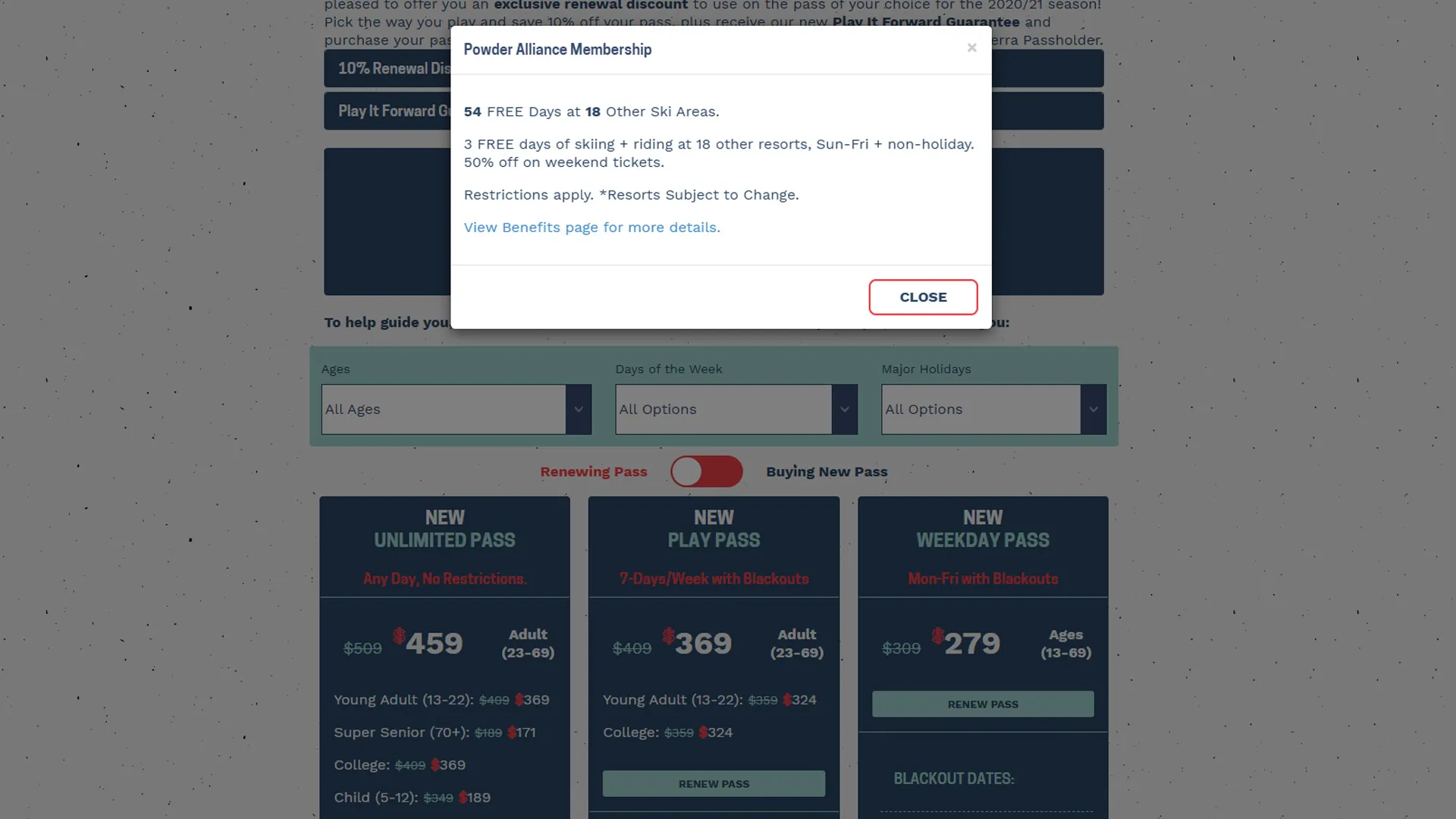
Renewing vs. New Passholder Toggle
One of the most impactful features was the pricing toggle between:
- Renewing Passholder pricing
- Buying New Pass pricing
By default, the experience emphasized renewal pricing and renewal CTAs:
<label class="toggler toggler--is-active" id="filt-renew"> Renewing Pass </label>Switching the toggle dynamically updated:
- Pricing
- CTA labels
- Promotional messaging
- Displayed pass groups
Examples included:
| Renewal State | CTA |
|---|---|
| Renewing | RENEW PASS |
| New Purchase | BUY NOW |
This allowed Sierra to serve two distinct audiences from a single unified interface.
From a marketing perspective, this reduced landing page fragmentation while maintaining personalization.
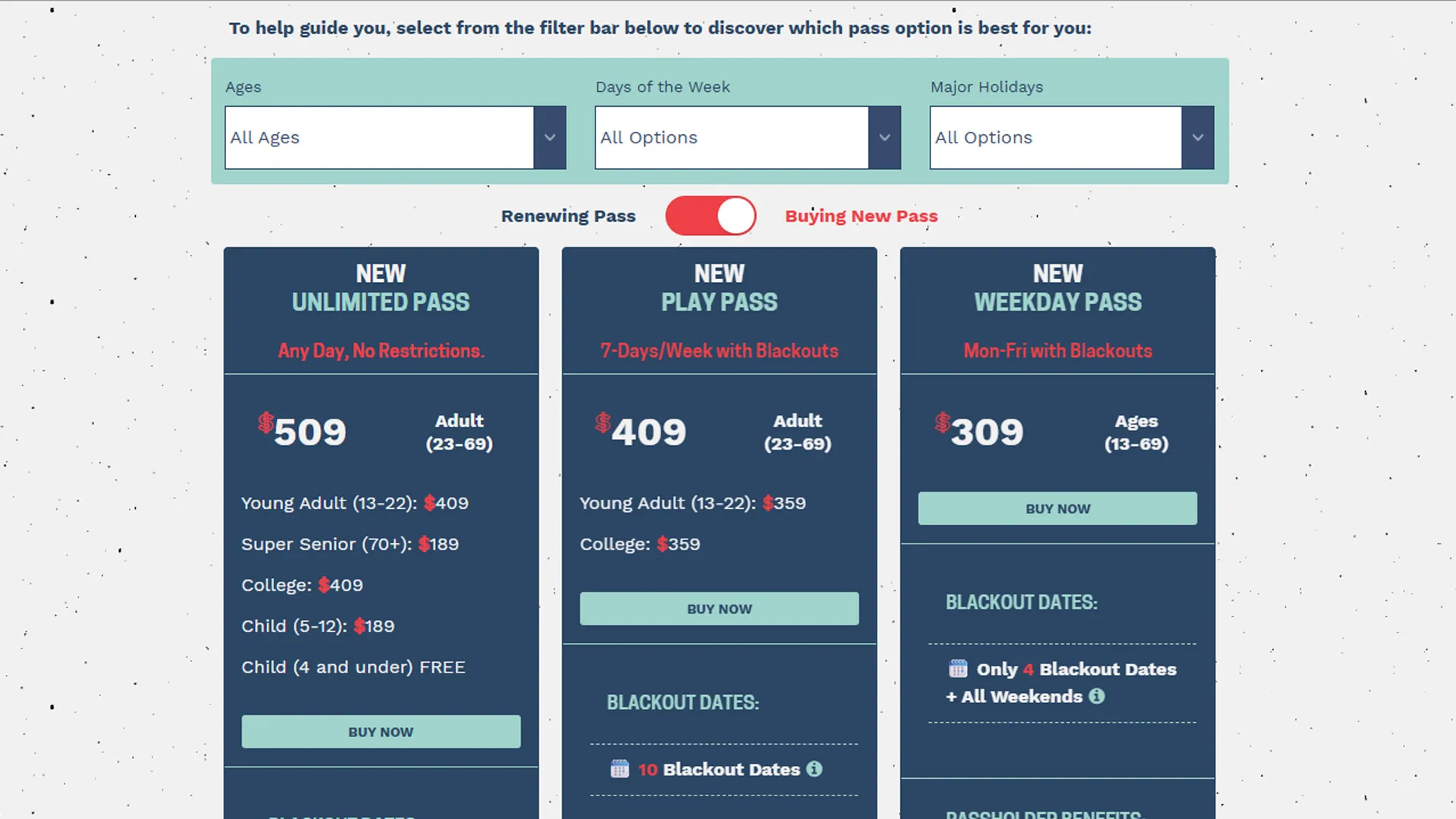
Responsive Mobile-First Design
Mobile traffic represented the majority of Sierra-at-Tahoe’s web visitors.
Because of this, the pricing interface was designed mobile-first from the beginning.
Key responsive considerations included:
- Stacked pricing cards
- Touch-friendly CTA buttons
- Collapsible information density
- Large typography for readability
- Scroll-friendly layouts
- Responsive spacing adjustments
- Simplified comparison patterns on small screens
The interface avoided traditional desktop-style comparison tables that often break down on phones.
Instead, each pass was presented as an independent responsive card containing:
- Pricing
- Benefits
- Restrictions
- Eligibility
- CTAs
- Supporting links
This structure dramatically improved mobile usability.
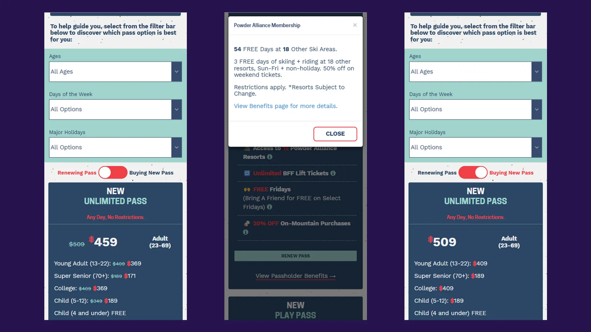
Interactive Benefit Modals
Season passes contained many nuanced benefits that required additional explanation.
Instead of cluttering the pricing cards with excessive text, I implemented contextual information modals triggered through inline icons.
Example:
<em class="fa fa-info-circle" data-toggle="modal" data-target="#myModal" role="button"></em>When clicked, users received detailed contextual information such as:
- Powder Alliance details
- Blackout date explanations
- BFF ticket restrictions
- Passholder perk information
- Benefit eligibility rules
Example modal content:
<div class="modal fade in" id="myModal">
  <div class="modal-dialog">
    <div class="modal-content">
      <div class="modal-header">
        <h4 class="modal-title">Powder Alliance Membership</h4>
      </div>

      <div class="modal-body">
        <p>54 FREE Days at 18 Other Ski Areas.</p>
        <p>3 FREE days of skiing + riding at 18 resorts.</p>
        <p>Restrictions apply.</p>
      </div>
    </div>
  </div>
</div>
This pattern supported progressive disclosure:
- Keep primary UI clean
- Reveal complexity only when requested
It also helped maintain conversion momentum by keeping users on-page rather than forcing them into separate informational pages.
Accessibility Considerations
Accessibility played an important role in the implementation.
Several accessibility-conscious decisions included:
- Semantic form controls
- Proper button interactions
- Touch-friendly mobile controls
- Readable contrast ratios
- Screen-readable content structure
- Descriptive link text
- Keyboard-friendly modal interactions
Because pass purchasing impacts a wide demographic range, ensuring usability across devices and abilities was essential.
Technical Architecture
The experience was intentionally built using lightweight frontend technologies:
- HTML
- CSS
- Vanilla JavaScript
- Bootstrap grid utilities
- Modal-based interactions
No frontend framework was required.
This approach improved:
- Page speed
- Maintainability
- Deployment simplicity
- Cross-device reliability
The filtering logic relied primarily on CSS class matching and DOM visibility toggling rather than complex state management systems.
This kept the implementation performant while remaining easy for future teams to maintain.
Marketing and Revenue Impact
From a marketing and business perspective, the project delivered several important benefits.
Improved Product Discovery
Users could quickly identify the best pass for their needs rather than manually comparing every option.
Reduced Decision Fatigue
Filtering simplified complex purchasing decisions into manageable interactions.
Better Mobile Conversion Experience
The mobile-first redesign significantly improved usability for the resort’s largest traffic segment.
Increased Visibility of Passholder Benefits
Interactive modals surfaced valuable perks that may have otherwise been overlooked.
Stronger Conversion Signals
The renewal toggle reinforced urgency and personalized messaging for existing passholders.
Increased Online Sales Revenue
Following implementation, Sierra-at-Tahoe observed improved online engagement and increased season pass revenue during promotional periods.
Lessons Learned
Personalization Does Not Require Heavy Frameworks
Even lightweight frontend architecture can deliver highly personalized experiences when interaction patterns are thoughtfully designed.
Filtering Is a UX Tool, Not Just a Technical Feature
Good filtering reduces cognitive load and helps users feel confident in decision-making.
Mobile Commerce Requires Different Design Thinking
Desktop comparison tables rarely translate well to phones. Designing specifically for mobile interactions creates a significantly better purchasing experience.
Progressive Disclosure Improves Clarity
Interactive modals allowed detailed information to remain accessible without overwhelming the main interface.
Frontend UX Directly Impacts Revenue
Improving usability, discoverability, and confidence during purchase decisions can meaningfully influence conversion performance.
Conclusion
The season pass comparison experience became more than just a pricing table — it evolved into a guided product discovery system tailored to Sierra-at-Tahoe’s guests.
By combining:
- Responsive design
- Dynamic filtering
- Personalized pricing states
- Interactive education patterns
- Lightweight frontend architecture
…the experience transformed a traditionally complex purchasing process into something significantly more approachable and conversion-focused.
The project reinforced an important lesson that applies across both marketing and frontend engineering:
The best digital experiences reduce uncertainty and help users make confident decisions quickly.
For Sierra-at-Tahoe, that meant helping guests spend less time deciphering pass restrictions — and more time getting excited about skiing and snowboarding.