Pricing pages are one of the most important conversion points on an e-commerce website. They are where users compare options, evaluate value, and ultimately decide whether to purchase.
At Sierra-at-Tahoe, the lift ticket pricing page served a broad audience: first-time visitors researching vacation costs, returning passholders comparing products, families planning group trips, and mobile users purchasing tickets while traveling. The challenge was not simply displaying pricing data — it was making large amounts of structured information usable across every screen size without sacrificing readability or performance.
To solve this, I designed and developed a fully responsive pricing table using only semantic HTML and CSS. No JavaScript frameworks, plugins, or third-party libraries were required. The implementation focused on mobile usability, accessibility, performance, and conversion optimization while supporting the resort’s growing online sales strategy.
The result was a lightweight, maintainable pricing experience that improved usability across devices and contributed to increased online ticket sales revenue.
The User Problem
Traditional pricing tables work well on desktop screens because horizontal layouts have enough room to display multiple columns simultaneously. On mobile devices, however, those same layouts often become difficult to read:
- Users must pinch and zoom
- Horizontal scrolling creates friction
- Column relationships become confusing
- Calls-to-action become harder to tap
- Important pricing differences are easy to miss
For a ski resort, this problem becomes even more important during winter travel planning, where users frequently browse pricing pages from phones while commuting, traveling, or comparing resorts.
The goal was to preserve the clarity of a desktop comparison table while making the experience effortless on smaller screens.
Project Objectives
The responsive pricing table project focused on several business and UX goals:
- Improve pricing readability on mobile devices
- Increase online ticket purchase conversions
- Reduce friction during product comparison
- Maintain accessibility standards
- Eliminate dependency on JavaScript or plugins
- Ensure fast load times during high-traffic winter periods
- Create a maintainable structure marketing teams could easily update
Frontend Architecture Overview
The implementation used a straightforward architecture built entirely with semantic HTML and CSS:
- Standard
<table>markup for structured pricing data data-labelattributes for mobile row labeling- CSS pseudo-elements for responsive labels
- Media queries for layout transformation
- No JavaScript required
- No third-party responsive table plugins
- Minimal DOM complexity
The desktop experience preserved the familiar tabular comparison layout, while the mobile experience transformed each row into a vertically stacked card layout optimized for smaller screens.
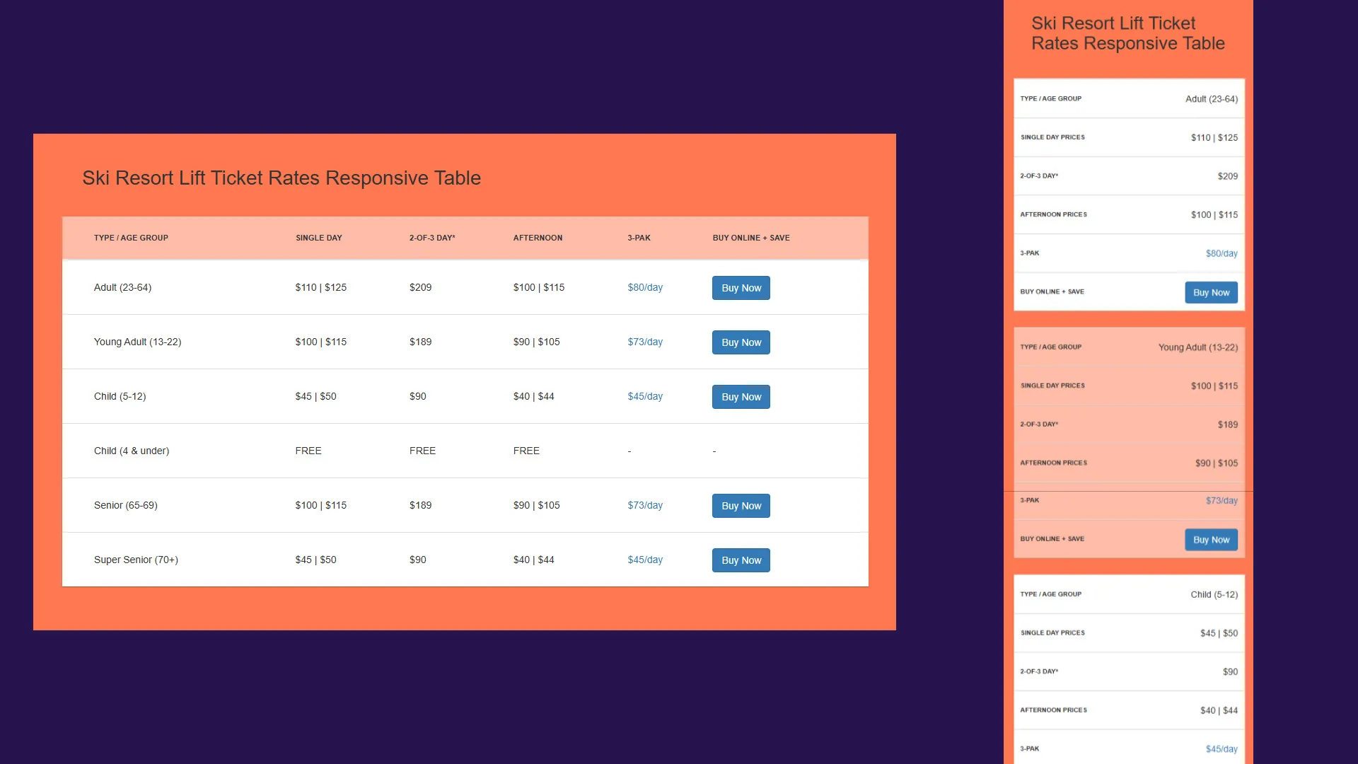
Desktop Experience
On larger screens, the table behaves like a traditional pricing matrix:
- Product categories remain aligned in columns
- Users can quickly compare pricing tiers
- Calls-to-action remain visible within each row
- Seasonal pricing relationships stay easy to scan
The structure uses semantic table markup:
<table class="table">
  <thead>
    <tr>
      <th>Type / Age Group</th>
      <th>Single Day</th>
      <th>2-of-3 Day*</th>
      <th>Afternoon</th>
      <th>3-PAK</th>
      <th>Buy Online + SAVE</th>
    </tr>
  </thead>
</table>
Because the markup remains semantic, screen readers and accessibility tools still interpret the data correctly as tabular content.
Mobile Transformation Without JavaScript
The most interesting part of the implementation was the mobile layout transformation.
Rather than introducing JavaScript-driven responsive behavior or replacing the table with a completely different mobile component, the solution used CSS media queries and pseudo-elements to reformat the existing markup.
At smaller breakpoints:
- The table header is visually hidden
- Each table row becomes a stacked card
- Individual cells become block-level elements
- Labels are generated dynamically using
data-label
The core responsive behavior:
@media screen and (max-width: 800px) {
  table thead {
    display: none;
  }

  table tbody tr td {
    display: block;
    text-align: right;
  }

  table tbody tr td:before {
    content: attr(data-label);
    float: left;
    text-transform: uppercase;
    font-weight: bold;
  }
}
Each cell pulls its label from the HTML:
<td data-label="Single Day Prices">$110 | $125</td>This approach preserved the meaning of the data while dramatically improving mobile readability.
Why the data-label Pattern Worked Well
Using data-label attributes provided several advantages:
1. No Duplicate Content
The mobile labels are generated directly from existing HTML attributes, meaning the content only exists in one place.
2. Better Maintainability
Marketing teams updating pricing information did not need to maintain separate desktop and mobile versions of the table.
3. Lightweight Performance
No JavaScript execution or DOM manipulation was necessary for responsiveness.
4. Accessibility Benefits
The table retained semantic structure while still adapting visually for smaller screens.
Visual Design Decisions
Several styling decisions were intentionally designed to improve readability and conversion performance.
Color-Coded Hierarchy
Distinct colors were used throughout the table to improve scanning and separate content sections visually:
table thead {
  background: #ffbca7;
}
Card-Style Mobile Rows
On mobile, spacing and background changes created card-like separation between pricing rows:
table tbody tr {
  border-bottom: 25px solid #ff7850;
}
This improved touch usability and reduced visual crowding.
Strong Call-to-Action Visibility
The “Buy Now” buttons remained prominent across all screen sizes, helping preserve conversion opportunities even on smaller devices.
Responsive Behavior Across Devices
The table was tested across:
- Desktop monitors
- Tablets
- Mobile phones
- Landscape mobile layouts
- Older mobile browsers
One particularly important implementation detail was preserving readability without requiring horizontal scrolling. Many responsive table solutions at the time simply wrapped the table in an overflow container, forcing users to scroll sideways.
Instead, this implementation fully reformatted the content into a mobile-native layout.
Accessibility Considerations
Accessibility was an important part of the implementation.
Semantic HTML Structure
Using native table markup ensured screen readers could correctly interpret relationships between rows and columns.
Descriptive Link Attributes
Call-to-action links included descriptive labels:
<a class="btn btn-primary" href="#" title="Click here to Buy Adult Lift Ticket Online"> Buy Now </a>Readable Typography and Contrast
Spacing, font sizes, and color contrast were chosen to improve readability for users across devices and viewing conditions.
Reduced Cognitive Load
The stacked mobile format reduced visual complexity and made information easier to process quickly.
Performance Benefits
One of the biggest advantages of the implementation was performance simplicity.
Because the experience relied entirely on HTML and CSS:
- No JavaScript parsing was required
- No plugin dependencies were introduced
- No runtime layout calculations were needed
- Rendering remained extremely lightweight
This was especially valuable during high-traffic winter periods where page performance directly affected conversion rates.
Business Impact
The pricing table became a core conversion-focused component of Sierra-at-Tahoe’s e-commerce experience.
After implementation:
- Mobile usability improved significantly
- Product comparison became easier across devices
- Guests could evaluate pricing faster
- Online ticket purchase flow friction was reduced
Most importantly, the improved experience contributed to increased online sales revenue.
This project reinforced an important lesson in digital marketing and UX: conversion improvements do not always require complex technology stacks. Sometimes the most impactful solutions come from simplifying the experience and optimizing the fundamentals.
Technical Lessons Learned
Responsive Design Is About Prioritization
The challenge was not making the table “fit” on mobile — it was deciding what information users needed most and how to present it clearly.
CSS Can Replace Significant JavaScript Complexity
Many responsive interactions can be solved with modern CSS techniques rather than introducing additional frameworks or plugins.
Structured Data Matters
Semantic HTML made the responsive transformation significantly easier and preserved accessibility benefits automatically.
Mobile Commerce Requires Reduced Friction
Even small usability improvements on pricing and checkout-adjacent pages can influence conversion behavior.
Conclusion
The responsive lift ticket pricing table project demonstrated how thoughtful frontend engineering can directly support business goals.
By combining semantic HTML, responsive CSS, accessibility best practices, and mobile-first UX thinking, the implementation delivered a fast, maintainable, and conversion-friendly pricing experience without relying on JavaScript frameworks or third-party plugins.
For Sierra-at-Tahoe, the project improved usability during a critical part of the customer journey while supporting broader digital commerce initiatives. For users, it created a cleaner and more approachable experience across every device.
Sometimes the best frontend solutions are not the most complex — they are the ones that make important information feel effortless to use.